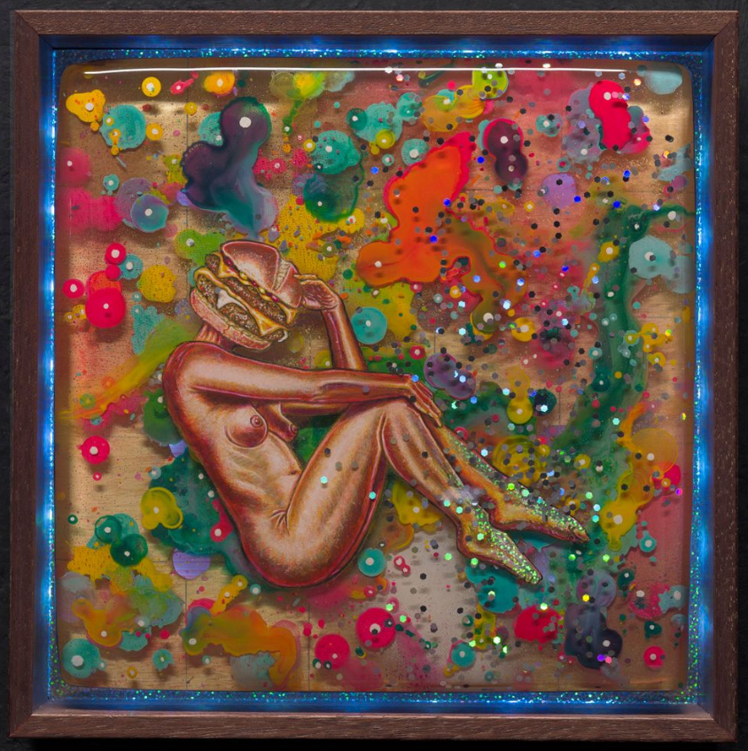
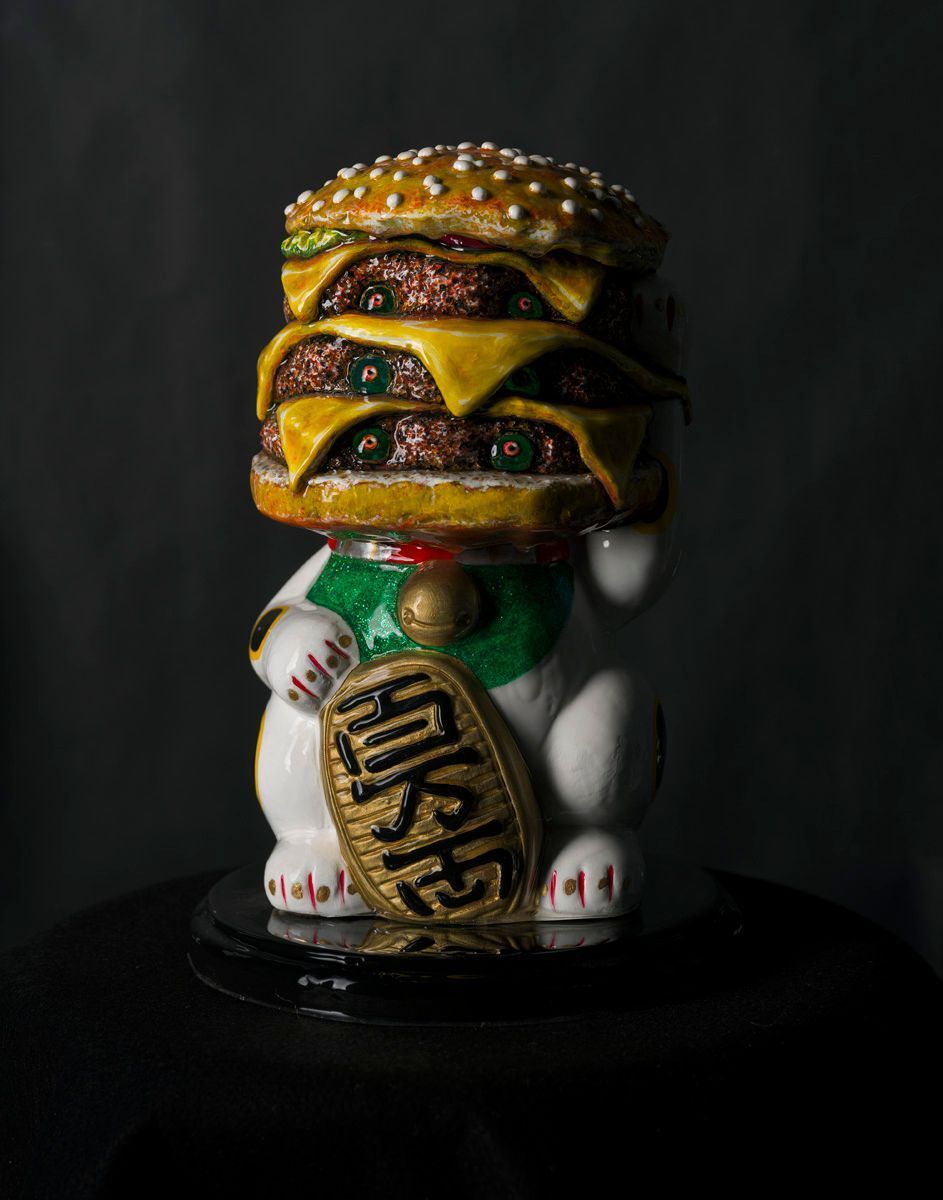
Meet the Artist: From Scotland to Seattle
Discover the best portfolio websites for artists to showcase and sell art online.
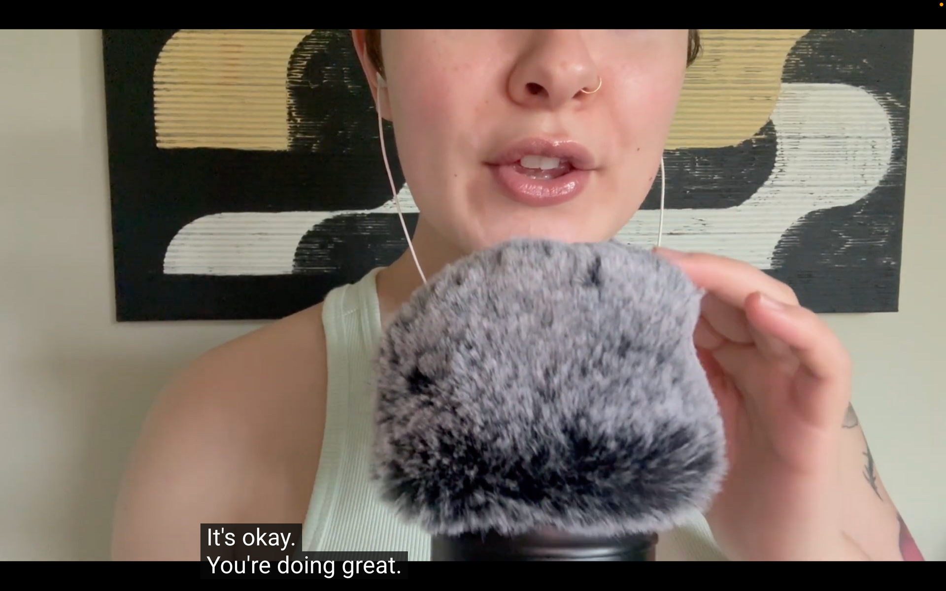
Watch Part 2 of our ASMR Artist Affirmation series. Explore the psychological journey of the "quiet" phases in an artist's career and how to keep going.
Tired of the tech grind? Turn your artist website into a digital gallery that works for you with 3 essential tips for streamlining your creative business.
Compare digital & physical artist portfolios. Learn how to present your work effectively and connect with your audience.
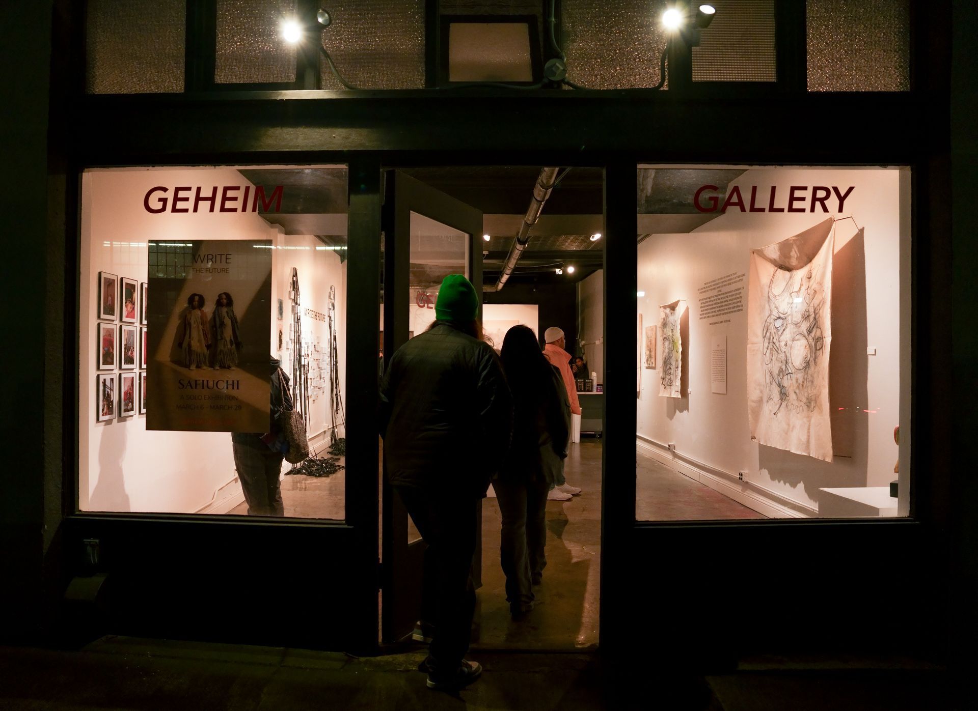
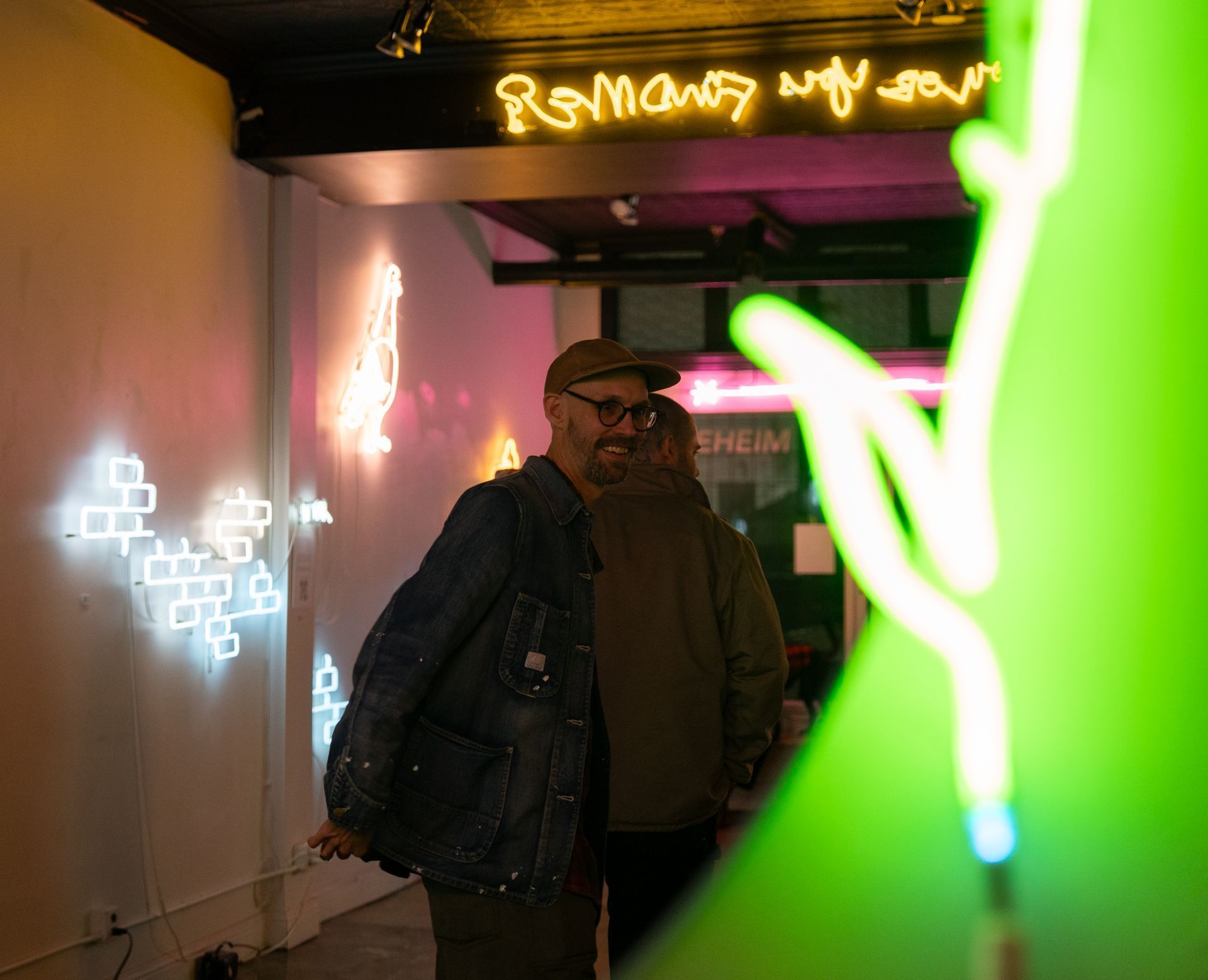
Plinths partners with Geheim Gallery to enhance artists' online presence. Get started today to showcase your work effectively!
Explore the challenges artists face & the power of self-affirmation. Join Plinths for tools to support your creative growth.
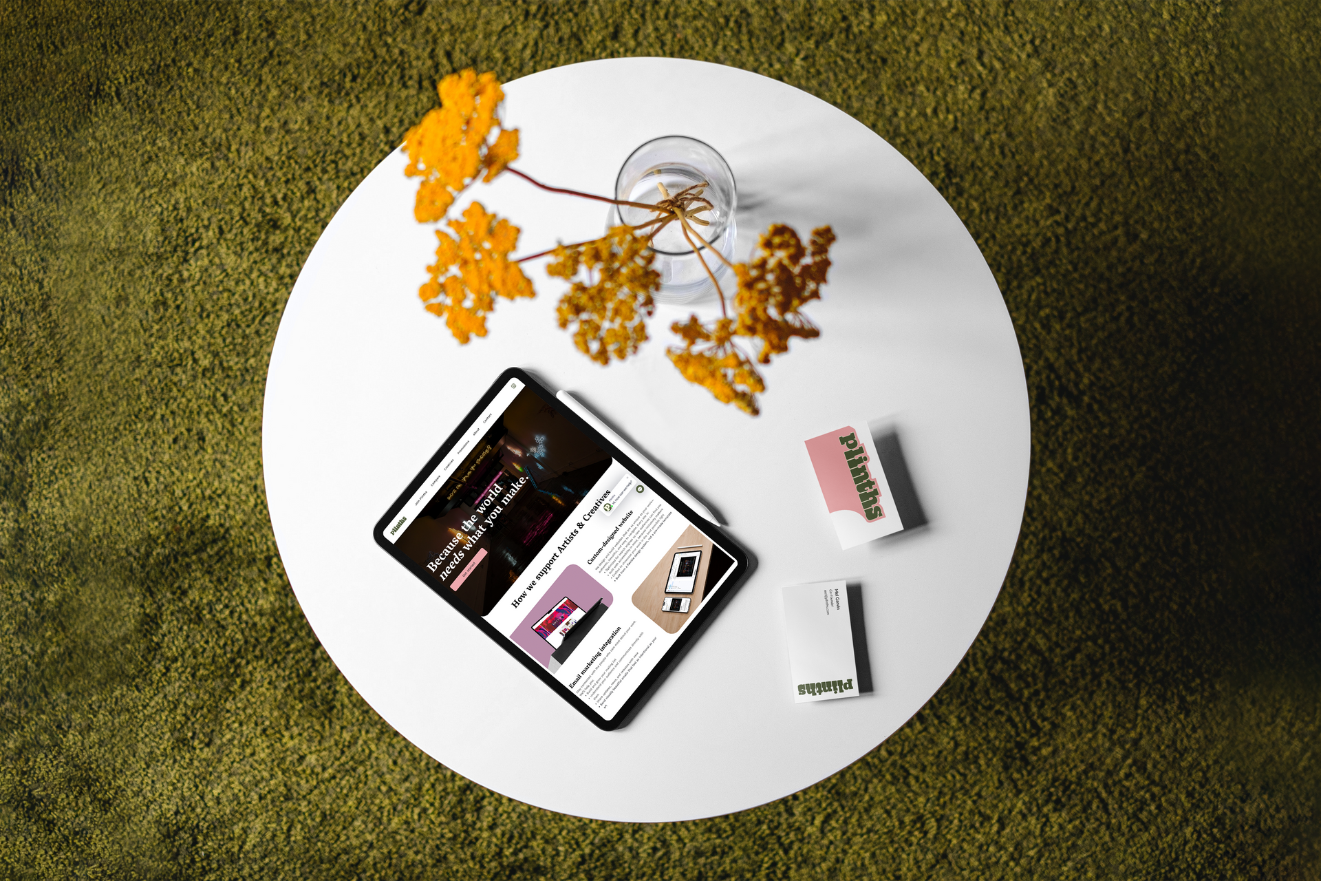
Learn to market & sell your art online effectively. Build your site with Plinths & start reaching a global audience today!
Learn how to choose the right website builder for artists. Get insights on features like e-commerce & design flexibility to sell your art online.